Monday, 9 March 2009

Evaluation

1. In what ways does your media product use, develop or challenge forms and conventions of real media products? Compare and contrast your own sequence and one which you think has generically influenced you.

Our main influence for our opening sequence was 'Mean Girls' as we thought that our chosen genre, teen romcom, investigate the stereotypes within teenagers.

Labels: , ,

Mean Boys

Here is our finished product 'Mean Boys'

Labels: , , ,

Monday, 2 March 2009

Rough cut

Labels: , , ,

Friday, 13 February 2009

Film Analysis

For my analysis of a teen 'Romantic Comedy' (romcom), I have chosen analyse the opening sequence to Mark Waters 2004 film 'Mean Girls'. i will be looking to see how different micro elements, e.g. mise en scene, editing, sound and camera work are used to establish the story line, characters and the genre. As well as watching the opening sequence to the film, I will be using other resources to find out information about the film, like Wikipedia, IMDb and Google, so that I will be able to find out the name of the songs used, and who they are by, etc.

Mean Girls is a controversial teen romcom, which covers all aspects of modern teenage life, like cliques, ethnical background, sexuality,etc, and the problems that can arise from these, like bullying, racism and homosexuality, but they are still covered in a comic fashion, so you may even say it was leaning over to black comedy. The film is centered around the protagonist 'Cady Heron' (Lindsay Lohan) and shows her lifestyle change when her family move from the desesrts of Africa, to the concrete jungles that is America, and how she realises that life in America isn't quite the walk in the park she thought it would be.


The music chosen for the opening sequence is

Labels:

Thursday, 12 February 2009

Production Company Logo

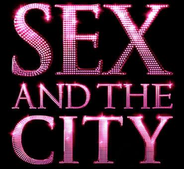
Unfortunately, using photoshop for our production company logo wasn't possible because we were not able to make our logo either sparkle, or diamond covered, and as the inspiration for our logo is the Sex & The City film logo we knew that without these elements our logo could end up looking messy and unprofessional. Thankfully "www.photobucket.com's" photo editing offered sparkly lettering, so I made our logo on there. We decided to call our production company 'SSGE PRODUCTIONS', because we all wanted to make our mark on the piece of work, and we felt the best way of doing this equally was to take the first letter from each of our first names (Shaun, Stephen, George & Emily) for a simple, and yet affective company name. Here is my first attempt a our logo;


After having made the pink logo, as our group is made up of three boys and one girl, we decided that the logo is a bit too feminine, I thought that perhaps checking what the logo would look like if the text were blue, and would make a difference on how girly the logo is;


After having made the blue sign I thought that as we are making a chick flick, the blue sign is not girly enough so i added a tiara, as they are very common in chick flicks aimed at girls age 12+, like in 'A Cinderella Story', 'Princess Diaries', 'Mean Girls', etc, and would be likely to make an appearance in our film in a prom or some sort of college ball, were it to be made in a feature length production;


But then I thought the crown looked a bit out of place on our logo and caused it loose some sense of professionalism as it didn't sparkle, unlike the rest of our logo so I asked the rest of the group for there opinions. I then chose to go with the original Sex & The City inspired logo, as it is the most professional looking logo out of the above and the most suited to the genre and storyline for our film opening.


Official 'SSGE Productions' production company logo;

Labels:

Friday, 30 January 2009

Animatic


Drawing and editing by Shaun Kaba
Music by Emily Tofts

Labels: ,

Thursday, 29 January 2009

Company Production Logo

As we have decided to make chick flick we decided that the Sex & The City Film logo style would be suitable to make ours in. This is because our film opening is going to very girly and very stereotypically feminine and coated in all thing female, from fine jewelery, diamonds to boys, to shopping. This is much like the opening sequence to Sex & The Cityand there film logo is pink and covered in diamonds, so we believe this to be a good inspiration for our opening.

I have photoshopped Sarah Jessica Parker out of this picture and left just the writing, as this is almost exactly like the way we want ours to look.

Labels: